
A key element of sales is understanding where your customer is at, and then telling them what they need to hear to make the sales decision.
When it comes to your website, 3 main questions need to be answered (as quickly as possible).
There may be other smaller questions, but these main ones ALWAYS need to be answered, on almost every page.
Is this the right solution for me? Do they have the service/product that I am looking for? Can these guys solve my problem?
Are they legitimate? Is it worth the risk of spending my money here, or should I find a more trustworthy/reliable company?
What do I need to do to go ahead and start getting the result I need? What action do I need to take?
You want to answer these questions as quickly and clearly as possible because if you make it too ambiguous or don’t answer the question, you’ll lose people who give up or get frustrated and go away to keep searching for other solutions.
Some creative designs and clever tag lines can make you feel cool, but they leave your customers wondering what it is that you actually do. Get to the point!
Your website design should feel like the kind of business you are and appeal to your target audience. The images, icons and graphics should all help paint the picture of the solution you offer.
But more importantly, your homepage and all key landing pages should have a big heading that is a clear statement of what solution you offer and who it is for.
This helps your ideal clients instantly know they are in the right place, and it helps the search engines to understand what you are about too.
With so many online scams and dodgy operators, it’s natural for people to feel a bit paranoid about handing over their email or credit card data. Most have been burnt before.
So you will increase your website sales if you dismiss these fears and prove that you are a legitimate business. You can quickly show your site is legitimate and can be trusted by:
A lot of business websites have all the right information on the page about their service, but then leave it up to the customer to figure out that they need to go to the contact page and send you an email if they want to do business with you.
If you want to increase online sales, it is critical that you make it obvious what they should do.
Keep in mind that people are sometimes very distracted or tired and don’t want to have to think when they are on your website.
So have a big button, with a contrasting colour and ‘action words’ on it, preferably in the top right corner, at the top of the page and the bottom of the page. So they can’t miss it.
You can get our team to do a performance audit of your website, which includes design adjustments to improve your online sales here - Conversion Audit.
Or you can learn how to do it yourself with our courses and coaching over at Evergreen Profit. There’s a free mini-course 5 Fundamentals of a High-Performance Website
Chat soon 🙂
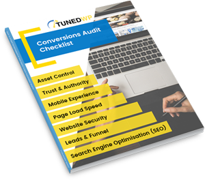
Created for businesses owners with any level of tech-experience, this simple audit will help you identify the areas of your website that are holding you back from growth. If your website isn’t performing as well as it could, this checklist will show you exactly where to start, so you can get more out of your marketing dollar.