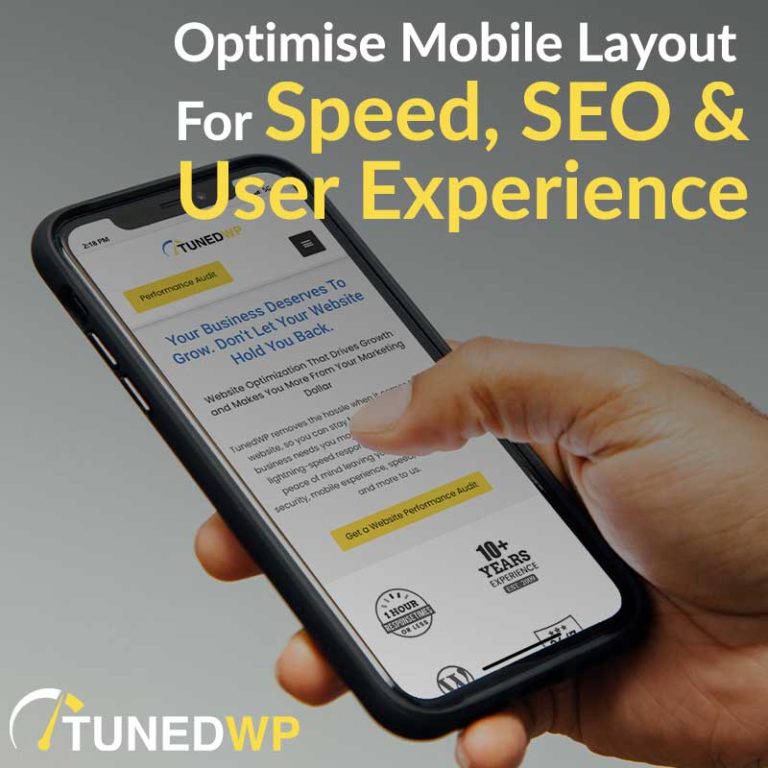
The section of the website that you see as soon as the page loads (before you scroll down) is called ‘Above The Fold’.
Probably a phrase from ye olde days of snail mail.
This section is critical to the success of your website, because visitors will make quick sub-conscious decisions about your business based on a few seconds of looking at it.
It needs to convey a clear message, assure visitors that they are in the right place and draw them into reading the page further and taking action.
On desktop layout, where there is plenty of space, it looks great to have a large background image, or a video sitting next to the headline, or a background video.
But when you shrink it down to a phone screen, either the text is hard to read or you lose the impact of the image because you can only see part of it. Your video background is either cropped or shrunk.
And these heavier media elements slow down the loading time on mobile devices, which impacts your user experience, conversions, SEO and ad costs.
Firstly you need to identify what are the key elements that people need to see.
On a Homepage or Sales Page your Headline is the most important element to highlight, together with probably a sub-heading, a call to action and perhaps a small trust building element.
Once you fit these elements onto a phone screen, you don’t have a lot of space left for anything else.
So remove the large background image and just use a plain colour background that helps those key elements stand out.
If you have a video or an image that visitors should see, consider just moving it down the page a little on mobile, so that the initial load time and mobile experience is awesome.
Then visitors are more likely to stick around, scroll down and see it.
On an article or blog post page the title is key. And then you want to jump straight into the content that people came for.
Move elements like author bio, feature image, date, social sharing etc further down the page.
I don’t know about you, but I hate having to scroll past that junk to get to the info that I came for.
For SEO, what Google wants is to help users get what they are looking for quickly, without getting frustrated. If you can do that, you are on to a winner.
If you want a team of experts to assess your website, get a Conversion Audit from TunedWP,
Or If you want to learn how to optimise your own website, check out the courses and coaching at Evergreen Profit.
See ya soon 🙂
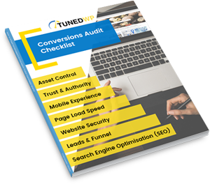
Created for businesses owners with any level of tech-experience, this simple audit will help you identify the areas of your website that are holding you back from growth. If your website isn’t performing as well as it could, this checklist will show you exactly where to start, so you can get more out of your marketing dollar.