
Navigating a website should be like a breeze on a hot summer day - refreshing and effortless. Yet, often, websites are more like a crowded marketplace, with too many signs pointing in every direction. When you make things super-easy, you remove roadblocks and the potential for users to get distracted and never return.
The easier and clearer the menu navigation, the quicker and easier users find what they need and make the decision to buy. You don't want your visitors to get lost in a maze of options. Then they get confused and need to think. Then they put off making the decision and they may never get around to coming back.
Simplify the menu at the top of your page. Make it as easy as possible for first-time users to find what they need without getting overwhelmed.
Less Decisions = More Sales.
First impressions count, and for many, the first encounter with your site starts with the navigation. Optimize your website for those experiencing your business for the first time. They should be able to identify and access the primary sections of your site without any guesswork. Think about the key pages they are most likely looking for and make these prominently accessible.
The majority of your website visitors have never seen your website before. Anything that is not for the first-timer can be moved down the page. People coming back will take the time to look for it.
Sometimes, you've got a lot to show, and that's great! But not everything deserves a spot in the top-tier navigation menu. Use submenus to organize pages logically. This approach not only declutters the main navigation bar but also groups relevant information together, making it more intuitive for users to find what they're after.
What goes on top? The essentials. The pages that speak directly to new visitors' needs and guide them towards your main call to action. Everything else? It can comfortably sit at the bottom or be linked elsewhere on your site. This prioritization helps in focusing the user’s journey towards conversion or other key actions.
If the thought of decluttering and organizing your website navigation feels daunting, don't sweat it. At TunedWP, we specialize in optimizing website structures for a seamless user experience. Whether it's through one of our audits or a strategy consultation, we're here to help your site’s navigation become a clear path to success.
In conclusion, streamlined website navigation is not just about removing excess. It's about creating a journey that guides each visitor smoothly from their initial click to their final destination on your site. Remember, a clear path leads to better engagement and, ultimately, more conversions.
If you need help optimizing your website, you can get our experts to do a Conversion Audit of your website, or book a strategy session with me to discuss your online marketing
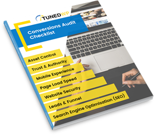
Created for businesses owners with any level of tech-experience, this simple audit will help you identify the areas of your website that are holding you back from growth. If your website isn’t performing as well as it could, this checklist will show you exactly where to start, so you can get more out of your marketing dollar.