Are you looking to increase your website conversions? A key element to focus on is the visual appeal of your call-to-action (CTA) section.
Research shows that a well-designed, visually appealing CTA can boost click-through rates by as much as 42% — which is a crucial step toward improving overall website conversions.
Let’s explore simple yet effective strategies to enhance your website's visual design to boost conversions:
Your call-to-action (CTA) sections are where you want visitors to take a specific action, such as making a purchase, filling out a form, or signing up for a newsletter. To make these areas more effective, consider these tips:
Your CTA should immediately grab attention. Use contrasting colours that stand out from the rest of your page to draw visitors' eyes directly to where you want them to go, making it easier for them to take action.
While contrast is important, avoid overwhelming visitors with too many colours or elements. A cluttered design can be distracting and reduce the effectiveness of your CTAs.
Use a simple, cohesive colour palette throughout your site. Ensure your text is easily readable against the background. Your overall design should be clean and uncluttered. This will help focus attention on your CTAs and improve user experience.
Also, use white space to give your CTAs room to breathe.
Beyond the design and colour of your CTA buttons, where you place them on your website can significantly impact their effectiveness. To maximise conversions, ensure your CTAs are positioned in prominent, easily visible locations on the page such as:
Place your primary CTA above the fold—this is the area of the web page that’s visible without scrolling. It’s the first thing visitors see so it’s a prime location for driving action.
Position the CTA at the end of your articles or product descriptions. After reading the content, visitors are more likely to take the next step, making it an ideal spot for a CTA.
Utilise sidebars or sticky bars that remain visible as users scroll down the page. These ensure your CTA stays within the user's view, regardless of where they are on the page.
In addition to well-designed CTA sections, your buttons should also be eye-catching and compelling. To create effective CTA buttons:
A well-designed button with a contrasting colour ensures that it doesn't blend into the background but instead stands out as the primary action point.
The text on your buttons should be straightforward and action-oriented. It should guide users on what to do next. Use phrases like "Buy Now," "Sign Up," or "Learn More" to create a sense of urgency and clarity.
Make sure your buttons are large enough to be easily clickable, whether your visitors are on a desktop, tablet, or mobile device. This enhances the user experience and makes it easier for users to take the desired action.
For your website to guide visitors naturally toward the actions you want them to take, your overall design should be seamless and intuitive. Your buttons and CTAs should be integrated into the design in a way that feels natural and unobtrusive.
To create a seamless user experience:
By implementing these design tips, you can create a website that not only looks great but also effective in boosting website conversions.
It can be tough to tell if your website’s design is truly driving conversions. Are your colours helping or hurting? Are your CTAs as effective as they could be?
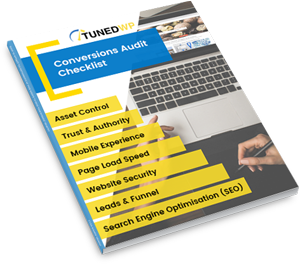
If you’re unsure, an expert review could make all the difference. Our website conversion audit service provides a clear, straightforward analysis of your site, highlighting what works and what needs improvement.
Check out our website audit service today or email us at [email protected] for more info!
Justin Meadows is the founder of TunedWP and creator of the Topic Domination Method. Since 2009, he’s worked across SEO, WordPress, website performance and conversion optimisation, helping businesses get more from their websites.
His work now includes AI search, where he focuses on helping businesses build the content, authority and online presence needed to be understood and recommended by tools such as ChatGPT and Google Gemini.