When designing the user experience of your website, you need to cater to the lowest common denominator. This is not to say the people who are stupid, but the people who are distracted! Data shows that people's attention spans are getting shorter and shorter when it comes to interactions on websites. That is also one of the reasons page load speed is becoming more important.
You need to consider the mum on the couch, browsing your website on her phone while also watching Netflix and explaining to a 5-year-old why he can’t have chocolate.
Or the stressed-out manager who is quickly checking the services on your website between meetings and trying to ignore the messages and calls currently lighting up his phone.
Or the exhausted worker who is on waiting in the queue for a coffee trying to buy that thing for his wife that he forgot to do yesterday.
Or the marketing manager who is having a drink in a busy bar and trying to keep up with conversation over loud music while taking a look at your website because her friend said you guys are the best.
You need to make it as easy as possible for these people to go from website visitors to become paying customers.
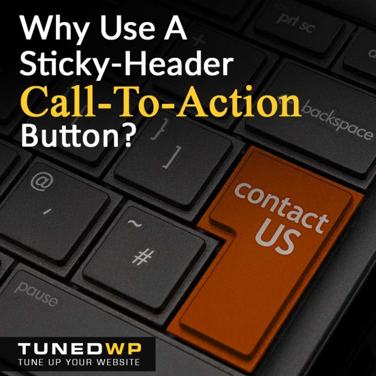
A Call-to-Action is a persuasive text and button in the website that prompts the user to take a specified action. This action is usually the next step in the process that they need to take to become a paying customer. CTA buttons have action-based text on them like ‘Buy Now’, ‘Sign-up’, ‘Download Now’, ‘Get Started’ or ‘Add to Cart’.
In some cases our primary CTA is to take people to the checkout to purchase a product or service immediately. But in other cases, it might be to become a ‘Lead’ by opting in for a free trial or course, booking a free consultation, getting a quote or contacting you to start a conversation.
A great CTA will grab the attention of our distracted website visitors and make it as easy as possible to take the next step in becoming a customer.
A good CTA is:
Site-wide. While you might have specific actions to take on certain pages or parts of the website, it is good to have a single, primary CTA that is targeted to the majority of first-time visitors. This can be displayed in the header and footer of every page.
Compelling and Attractive. CTA should stand out against the rest of the pages design and grab the attention of the customers. It should have persuasive action based wording.
Sticky. Your primary, header CTA should be visible on the screen at all times as the user checks out your pages and scrolls through your content so that as soon as they have made the decision to buy, the button is right there.
Clear and Simple. The text on the CTA button must be clear about what it is, what happens next, and what benefits it will bring in just a couple of words. Where you have space, this can be fleshed out with a few lines of text and an image near the button.
If you have trouble converting visitors into paying customers, get us to do a Conversion Audit of your website. We will check your Sales Funnel as well as your site’s Speed, Security, Design, etc with corresponding recommendations on how to fix the issues found.
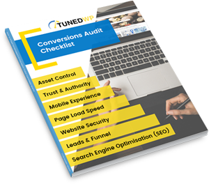
Created for businesses owners with any level of tech-experience, this simple audit will help you identify the areas of your website that are holding you back from growth. If your website isn’t performing as well as it could, this checklist will show you exactly where to start, so you can get more out of your marketing dollar.