
I learned this exercise from a mentor of mine, James Schramko: If you could wave a magic wand and get more of your best customers, what would that look like?
It is useful to first imagine what you really want if anything were possible. And then work out the steps to achieve that.
A lot of business owners think that they need to have a phone number on the top of their website, even if they don’t actually want more phone calls.
Conversely, if all you really want is more phone calls, there is no need to highlight any other contact methods.
So first identify what you really want customers to do, and then guide website visitors to that result.
It’s important not give people too many options at once. If you have a lot of things to offer them, establish a hierarchy for these offer on the page.
Identify what is your ‘Primary CTA’, this should be targeted to first-time visitors, and should directly lead them to becoming a paying customer. This is the CTA you will use site-wide.
This is because the majority of website visitors will be first-timers, and they are less familiar with you and what you have to offer.
And in most cases you should guide people directly to giving you money on your main website, not make them sign up for free stuff first. If they don’t go for the money offer, THEN you offer them something free.
Other offers should be given less prominence or featured lower down the page (perhaps in a Footer CTA section), things such as: lead magnets, secondary products, for smaller sections of the market or better suited to existing customers.
People familiar with you, or coming back to your website will spend more time looking on the page what something they know you have.
On your site-wide buttons, there is usually not much space, so keep it brief, 2-3 words. But on other Call To Action sections of the website, it can be better to be more descriptive of the offer.
Either way describe the result they will get from clicking the button in active terms.
For example ‘Get 30 Days Of Free Yoga’ instead of just ‘Sign Up’.
If you want help optimising your site for conversions, you can get a Conversion Audit HERE. Or check out the 5 fundamentals of a high-performing website.
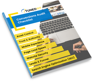
Created for businesses owners with any level of tech-experience, this simple audit will help you identify the areas of your website that are holding you back from growth. If your website isn’t performing as well as it could, this checklist will show you exactly where to start, so you can get more out of your marketing dollar.