Are your website visitors confused about what to do next? Call-to-action or CTA optimisation is key to guiding users toward your best offers, turning passive browsers into paying customers.
Let’s explore how to identify and design effective primary and secondary CTAs that engage your audience at every stage of their journey.
Think about your business. What’s your big ticket item, the main thing you do that solves the biggest problem for your clients? The thing that you would be happy to keep selling more and more of, every day. That’s your primary offer — the one thing most of your ideal customers should be saying "yes" to.
When visitors land on your website, they should immediately know:
Tip:
Ensure your primary offer is front and center, clearly highlighted on your sticky header, homepage, service pages, and landing pages. Think big, bold buttons, and concise messaging.
Not everyone will be ready to jump into your primary offer. Maybe they’re just getting to know you, or they’re not sure if you’re the right fit, or most likely, they want exactly what you offer, but now is not quite the right time and that’s okay!
Grabbing the secondary CTA is like putting their hand up and saying they're interested in having a taste, then they'll buy later. It’s a lower-commitment option that keeps them in your world while they warm up to the big one.
A few ideas for a secondary offer:
IMPORTANT: the secondary offer should be valuable and should be a logical first step towards getting the result of your Primary Offer.
Sidebars and inside blog content are other great places for the secondary CTA.
Wherever they are, the key is to make it super easy and visible, quietly saying, “Hey, no pressure, but how about this instead?”
Whether visitors find you through a referral, search engine, or your content, your website should guide them toward action.
Checklist for a CTA-friendly website:
Think of your primary and secondary offers like a funnel. The secondary CTA pulls people in, gives them a taste of what you’ve got, and when the time is right, leads them straight to the big one.
It’s like handing someone a sample at the supermarket. They take a bite, love it, and end up buying the family pack.
Now, let’s talk about how to make your CTAs work. It’s not rocket science — just a few tweaks can make a massive difference:
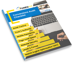
Not sure if your CTAs are pulling their weight? A website audit can give you a fresh set of eyes to see what’s working and what’s not. We’ll dig into your CTA placement, your messaging, and even your site’s overall flow.
Think of it like a tune-up for your website — making sure everything’s running smoothly and converting like a dream.
Your CTAs aren’t just buttons — they’re your silent sales team. Make sure they’re working for you, not against you. Focus on your primary offer for the go-getters and have a secondary offer ready for the fence-sitters.
Ready to get serious about your website’s performance? Book a call or email us at [email protected] to brainstorm your primary and secondary CTAs. Or start with a website audit to get tailored recommendations.
Don’t wait around. Let’s turn your website into the conversion machine it’s meant to be.