
In an age of increasing demands on people's attention, small improvements to your user experience and the layout of your website can turn into big improvements in profit.
Users don’t have much patience for frustrating websites, they expect things to be easy and quick. If you don’t meet those expectations, they will simply go find someone else.
Google knows this as well, they see how users behave on websites, and they will give preference to websites with a great user experience. You’ll rank higher and your ad clicks will be cheaper.
To this end, Google recently introduced its Core Web Vitals metrics as a way of measuring the user experience of your website.
Google now only look at your website as a mobile user. This is because since 2017 more people use the internet on their phones than on their desktop! So it is not good enough to just have a great user experience on the larger screens.
So most users will visit your website on a phone, and they are more likely to be distracted and impatient when doing so. Therefore it is critical that you make it as easy as possible for them to buy or opt-in at that point.
Think about how many times you have had a question pop into your head, or a thought to buy something. Likely the first thing you do is a quick search on your phone.
There are probably plenty of times that you get interrupted while doing this and think “I’ll get back to it later”. But you don’t always get back to it, do you?
This is where the Sticky Header helps the conversion. Firstly, you want to make sure that you keep it simple and have one clear Call To Action (CTA) button in the header.
This CTA button, along with the sticky mobile menu will stick to the top of the screen as the user scrolls down through your website.
Perhaps they are reading an article or browsing your services or FAQs. Then as soon as they are interested in working with you, or finding out more, that CTA button is right there on the screen.
They don’t have to scroll all the way to the top of the page, and browse through your menu to find the right page which might have the steps to get started. The button is right there.
Take a look at your website on your phone. Pretend to be your customer. Scroll down to mid-way through one of your pages or articles and then see how easy it is to buy or opt-in.
If you need help with optimising the mobile experience of your website, get a Conversion Audit from our team of experts. Also, have a listen to this podcast episode where I talk more about improving mobile experience.
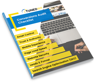
Created for businesses owners with any level of tech-experience, this simple audit will help you identify the areas of your website that are holding you back from growth. If your website isn’t performing as well as it could, this checklist will show you exactly where to start, so you can get more out of your marketing dollar.