
People use their smartphones to browse the web more often than laptops and computers.
This has been the case for about five years or so now.
But what makes it crucial right now is the fact that not only has Google created a separate index for mobile, it will also be the primary.
This means Google will primarily use mobile as a gauge when evaluating your site for indexing and ranking.
Designers used to think of desktops when they conceptualise designs for websites. But this poses several problems.
Since you have more space on a desktop, putting all the elements together to fit a small screen later on would be a huge challenge.
If you just convert from the desktop version, the text becomes too small to read, navigation becomes confusing and everything looks...squished together.
You won’t have this problem if your site is responsive. Responsive sites use optimised images and CSS styling that seamlessly changes the site according to the width of the screen.
If you are yet to build a site, look at the mobile version first before considering and assessing the desktop layout of your website.
For the best user experience across all devices and platforms, consider the most basic functions and features for a lower browser like mobile phones before slowly advancing to tablets and computers.
Don’t worry about not carrying over all the jazz of your site’s desktop version to mobile. You don’t need it!
People who are on their phones are in a different head space.
They are usually on the go and don’t have time to wait for slow sites to load. Nor do they have the patience to figure out how to navigate a complicated website.
Everything needs to be simple and easy and quick.
We broke down what it takes to have a good mobile experience into these easy, actionable tips:
Keep it mind:
if it doesn’t help the user get what they need quickly or if it doesn’t push them to decide to buy from you, then don’t put it there.
You can find more tips on how to prepare your site for mobile in this podcast episode.
Or you can let WordPress experts review your site and give customised recommendations for a better mobile-ready website. You can also shoot us an email at [email protected].
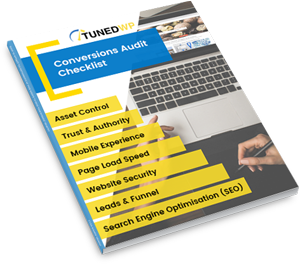
Created for businesses owners with any level of tech-experience, this simple audit will help you identify the areas of your website that are holding you back from growth. If your website isn’t performing as well as it could, this checklist will show you exactly where to start, so you can get more out of your marketing dollar.