
A client of mine optimised just 1 of these steps and increased his checkout page conversions from 8% to 18% (more than double!) I’ll tell you about that in a moment, but this is something that can make a huge difference to your bottom line!
This is another scenario where easy of use and user experience can really improve your conversions and therefore profits. It probably has a larger impact on small ticket items and impulse buys, but it will still affect larger ticket sales.
Users shouldn’t have to scroll. Remove any navigation from the header and footer, just leave a logo. 2 column layout works well; the form and payment details on the left and everything else on the right.
Re-iterate what is included and the key benefits if it is a service, provide an order summary and an image if it’s a product.
Include security seals, trust badges, credit card and payment gateway logos and any other trust elements you have. Include your best and most relevant testimonial, remind them of your guarantee if you have one.
Often people have one final niggling question that they want to answer to feel confident that your offer is right for them, make it easy for them to reach out and confirm that thing. Also, let them know that customer support is available if they have any issues after they purchase.
Try to keep the checkout form and short as possible, remove any unnecessary fields. Easy to use forms are especially important on mobile devices which can be frustrating to fill forms out on. Make sure your form supports auto-fill and consider adding google maps auto-complete to the address field.
Consider that additional information gathered at or before the checkout can reduce your conversion rates, but it may make it easier for you to deliver the service. A form after the sale will improve your conversion rates, but may not get filled out for some time and require follow-up.
Offering Paypal and Stripe as payment methods has been proven to increase conversions because some people strongly prefer one or the other.
But making the checkout process even easier is adding Google Pay or Apple Pay options. These are more convenient than going to find your credit card, and they are more trusted and secure.
Express checkout also makes the process smoother and easier for users. If they don’t need to add additional items to their cart, skip that step and go straight to checkout.
This is the step that resulted in more than doubling the conversions for one of my clients. Just by switching from a standard checkout to express checkout with Google pay and Apple pay increased his conversion rate from 8% to 18%
So I recommend you take a look at your websites checkout page and see if implementing these steps could improve it.
I am currently building some case studies for my conversion rate optimisation service, if you are interested in being a part of that, please send an email to [email protected] or get a conversion audit of your website https://tunedwp.com/performance/
P.S. shout-out to Scott Baptie from https://www.foodforfitness.co.uk/ thanks for letting me publish your results.
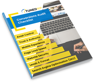
Created for businesses owners with any level of tech-experience, this simple audit will help you identify the areas of your website that are holding you back from growth. If your website isn’t performing as well as it could, this checklist will show you exactly where to start, so you can get more out of your marketing dollar.